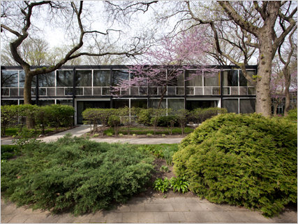
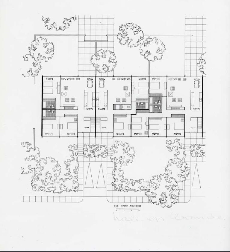
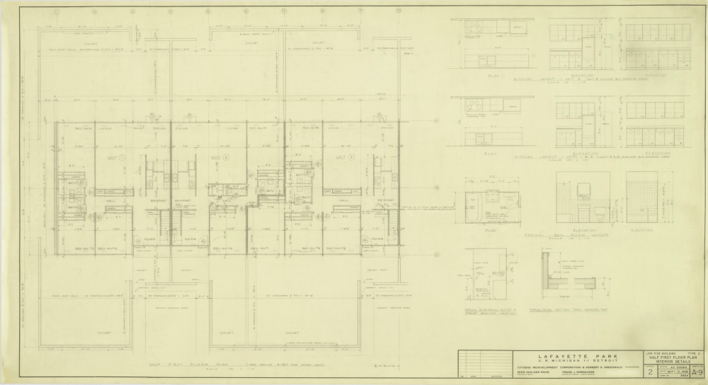
 The orthographic plans I’m looking at are Ludwig Mies Van Der Rohe’s Lafayette park apartments. The first orthographic representation depicts the separation of spaces by varied line widths, suggesting differences within the separation between the rooms ( ex. heavier line width is a more intense separation compared to a lighter one) . The rooms themselves are labeled as to what they are, making the plan seem map-like, orderly, and easy to navigate. The depiction of trees along with the outdoor space emphasizes the importance of nature or landscaping in relationship to the house, especially in creating outdoor domains on the South side of the building, and adds an organic element to the overall depiction of the home. The second orthographic drawing is done thinly and by hand, emphasizing the emptiness of the open rooms ( especially the bedrooms). Some rooms, like the bathrooms seem to be smaller due to all the measurements surrounding the items within the smaller space, creating more visual clutter. In opposition, many of the rooms seem more airy and open due to there being no furniture suggested or represented in some of the rooms (ex. bedroom and dining) .
