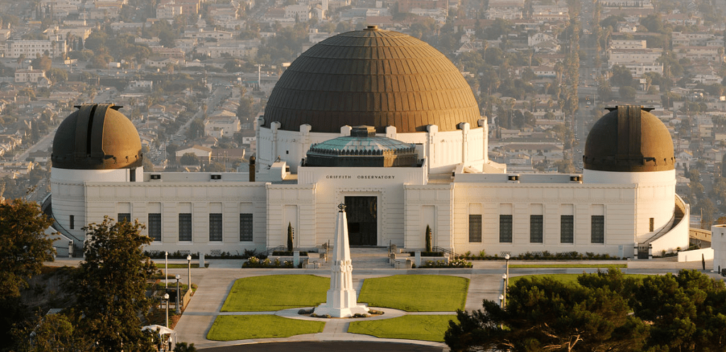
Griffith Observatory
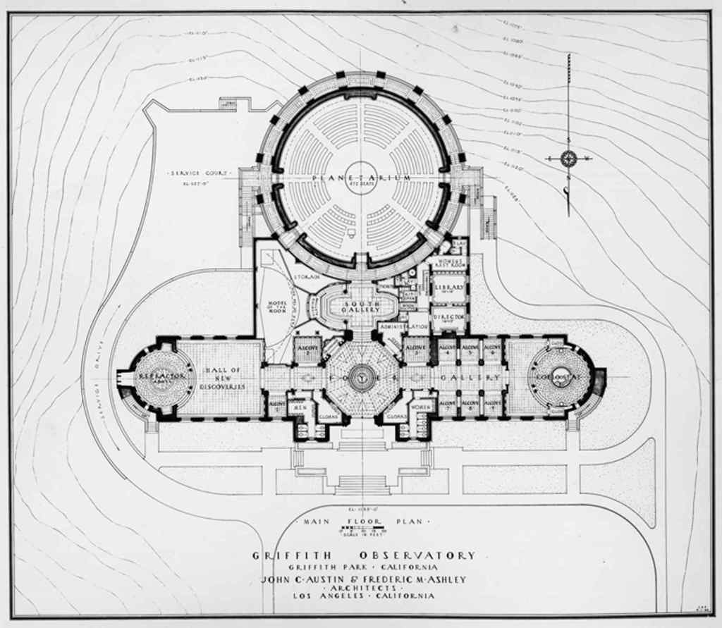
- Detailing to the inside of the building adding the grandness that the observatory represented for the city.
- Line weights and dot densities give texture and a sense of how each space flows into another including the compactness of each room.
- The planetarium becomes the focal point through the use of darker and thicker lines.
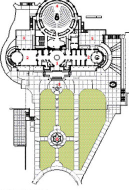
- Grid used on the outside spaces gives the viewer a better sense of the entire site surrounding the structure.
- Darker lines of the observatory help make a clear distinction between the structure and its surroundings which are drawn in thinner and lighter lines.
- The use of color cues you into the difference between green spaces, concrete walkways, and resting spaces and helps understand the functions of the space
